
hallmark
Naming
Branding
Tone of voice
Packaging
Collateral & Merch
Key image styling & photography
Photographer: Stephen Clarke
A hallmark is an official mark or series of marks struck on items made of metal, mostly to certify the content of noble metals — such as platinum, gold and silver. The term hallmark can also be used to refer to a particular distinguishing characteristic.
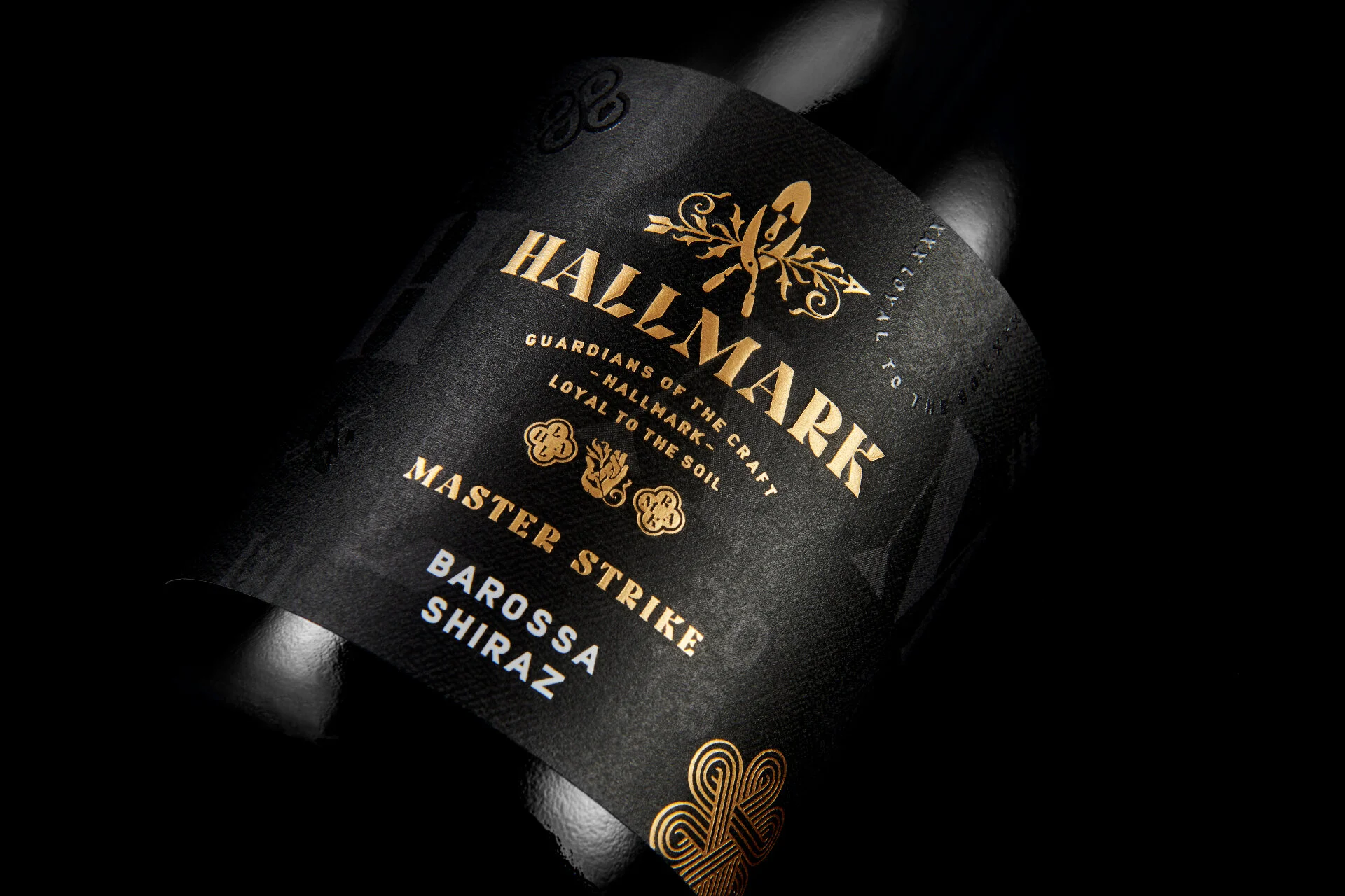
LOYAL TO THE SOIL / GUARDIANS OF THE CRAFT
Hallmark are a group of artisan winemakers, based in South Australia, with a roving mission to source small, precious parcels of exceptional fruit. And with that fruit, these 'wine alchemists' strive to create holistic wines with regional definition. The naming, branding and packaging needed to communicate this collective’s philosophy as well as express the handcrafted, limited release nature of the wines.
Hallmark's first small batch offering is the 'Master Strike' series which includes the noble varietal, Shiraz and a Grenache, both from the renowned Barossa region in South Australia.
The brand typography and a series of brand marks were all designed as a tribute to fine craftsmanship. Echoing their passion and precision, apparently random yet structured markings were combined with cultish catchphrases creating a deeper brand experience across the merchandise and collateral. All items were an opportunity to further the storytelling about their brand and express the reverence and passion that they approach their craft.


